For this project I was tasked with developing a new brand identity for a nearby brewing company called Aeronaut Brewing Company. This project was done as an exercise.
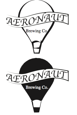
The first step to this project was research. My plan was to identify the target audience of this company as well as any directions that the brewery could utilize in order to improve their brand. I started by studying their standing logo. At first glance, It is memorable, simple, and identifiable to their brand. It’s a very effective logo. Scrolling through their website they even display a breakdown of their logo that brings to light hidden imagery. I’ve included their breakdown below for context.
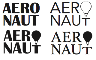
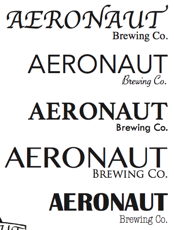
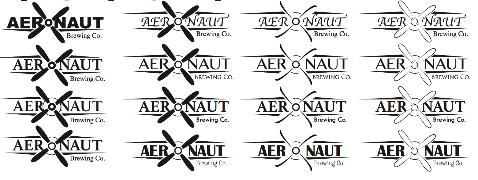
While their logo is very clever, I decided to go in a different direction, with the idea that the imagery should be easy to see rather than hidden. I began by sketching the name in the shape of a plane in reference to the aeronautic theme. This stuck with me and continued through to be the final logo design after refinement.
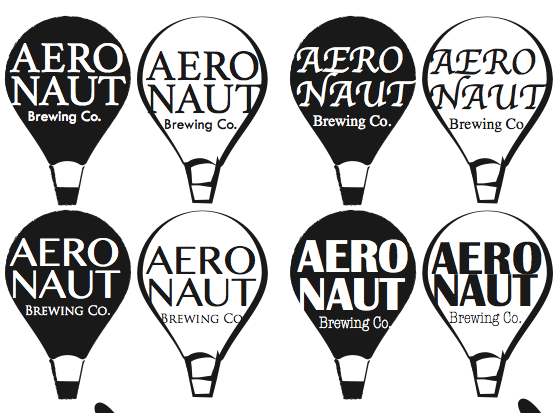
Below you can see several steps of the refinement process including different font pairings, different weights and thicknesses, positioning as well as some alternative designs that were considered during the process.
With the brand logo developed, I moved forward into designing newly branded packaging, including beer bottles, cans, and six-packs. The packaging was created for two of the brewery’s flavors of beer. These designs can be seen below.

